Interior design of a restaurant in Montmartre
- Location: Paris 18
- Area: 110 m²
- Objective: Optimize workflows and the customer experience
Une façade bleue, deux entrées
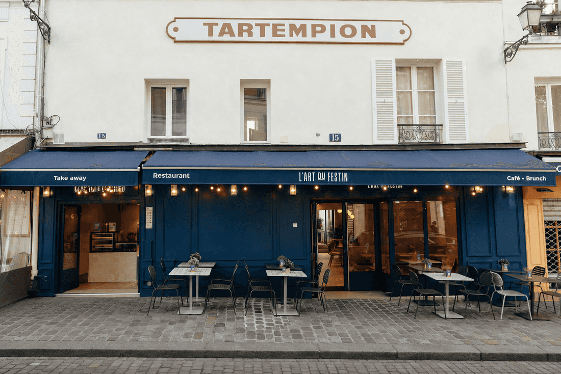
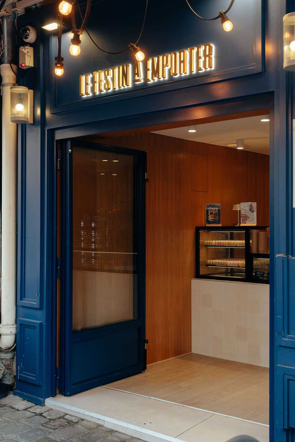
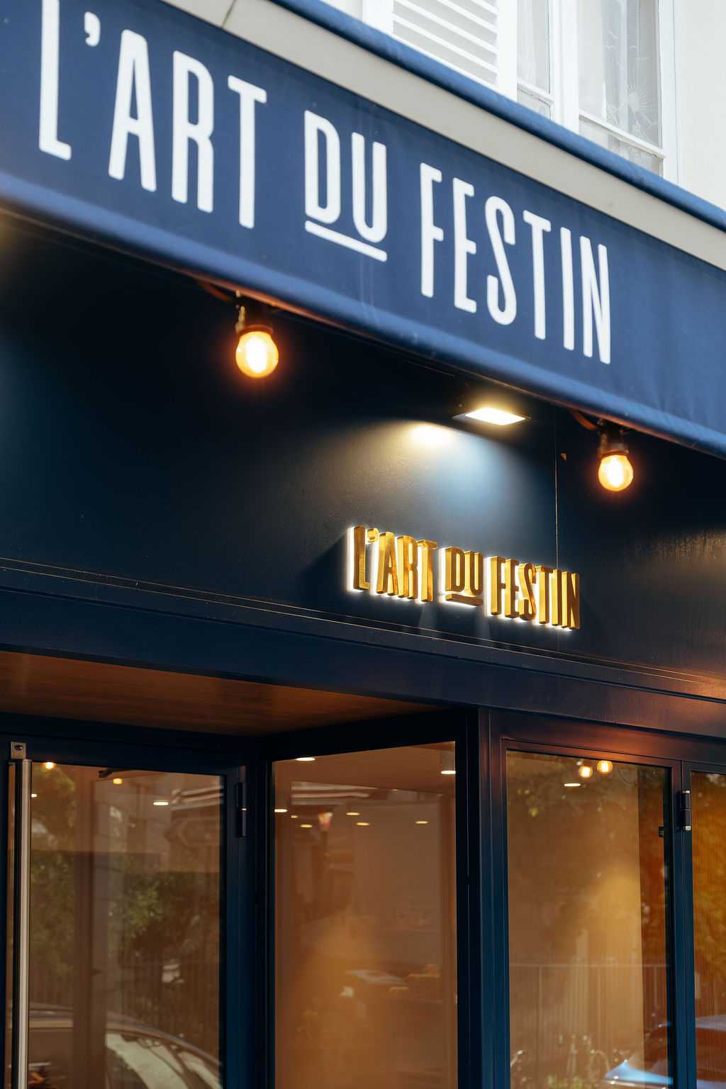
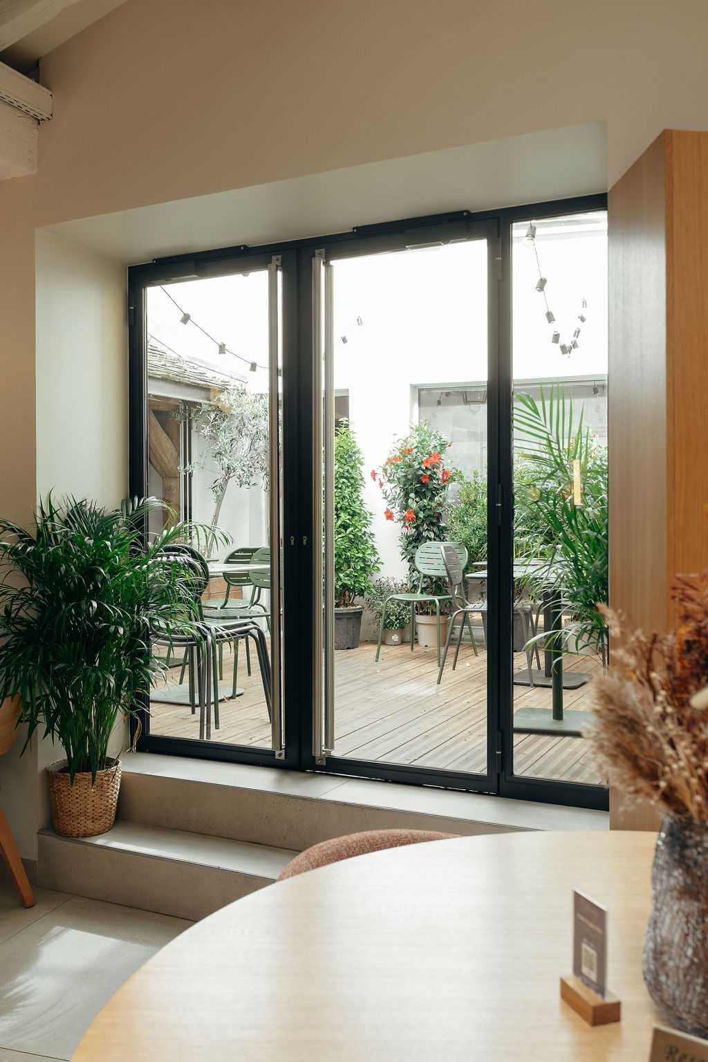
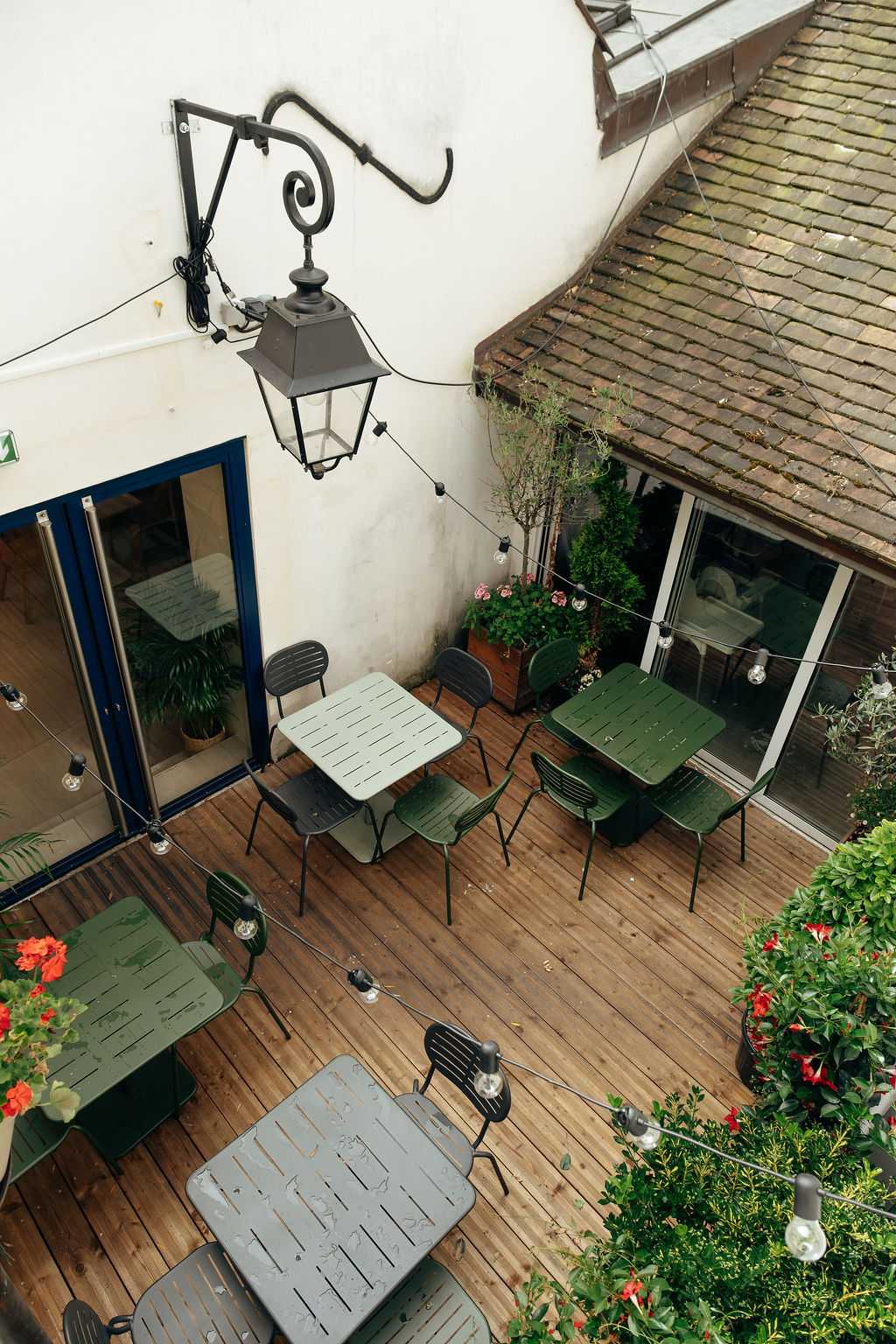
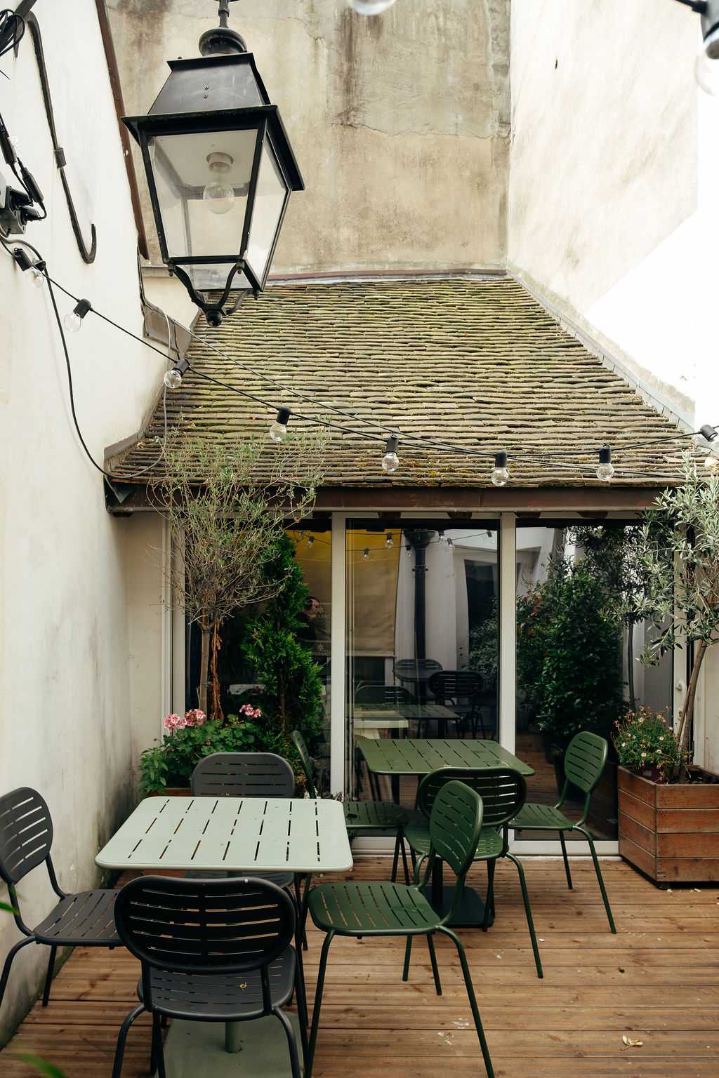
La façade annonce le propos, un bleu intense, dans une large unité visuelle, qui distingue deux entrées claires et exposées. À gauche, on accède à l’espace de la vente à emporter (pâtisserie, viennoiseries, glaces, café, …). À droite, on découvre toute la profondeur du restaurant, des premières tables jusqu’à la cour privative à l’arrière.
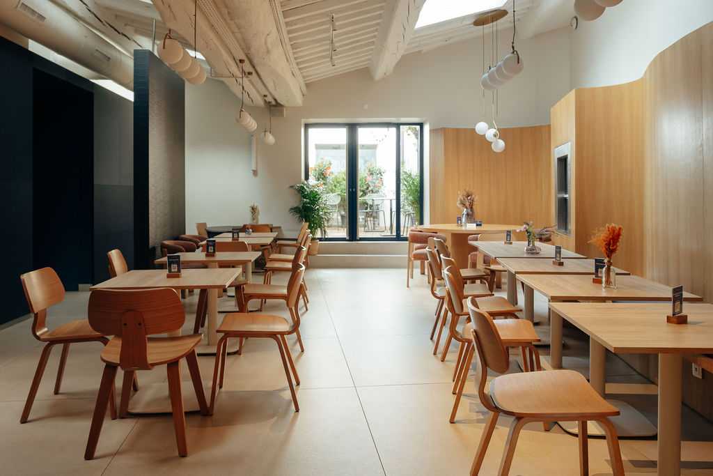
Une distribution optimisée a été proposée tout en prenant en compte les contraintes du bâtiment, notamment le plafond qui est particulièrement bas. L'espace se réhausse directement par une charpente ancienne et massive faite de grandes poutres en bois centenaires.
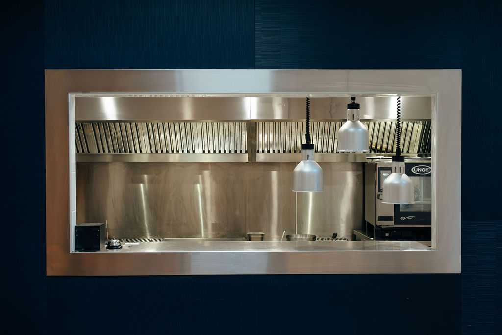
Dans la continuité de l’espace de vente à emporter à gauche, on trouve les cuisines. Cette organisation en enfilade permet d'optimiser le volume général et de distribuer méthodiquement les flux entre les différents postes.
L'accueil et le bar se situent immédiatement dans ce premier espace pour permettre au service de diriger intelligemment le visiteur vers la place adaptée à son envie.
Des agencements pensés pour chaque ambiance
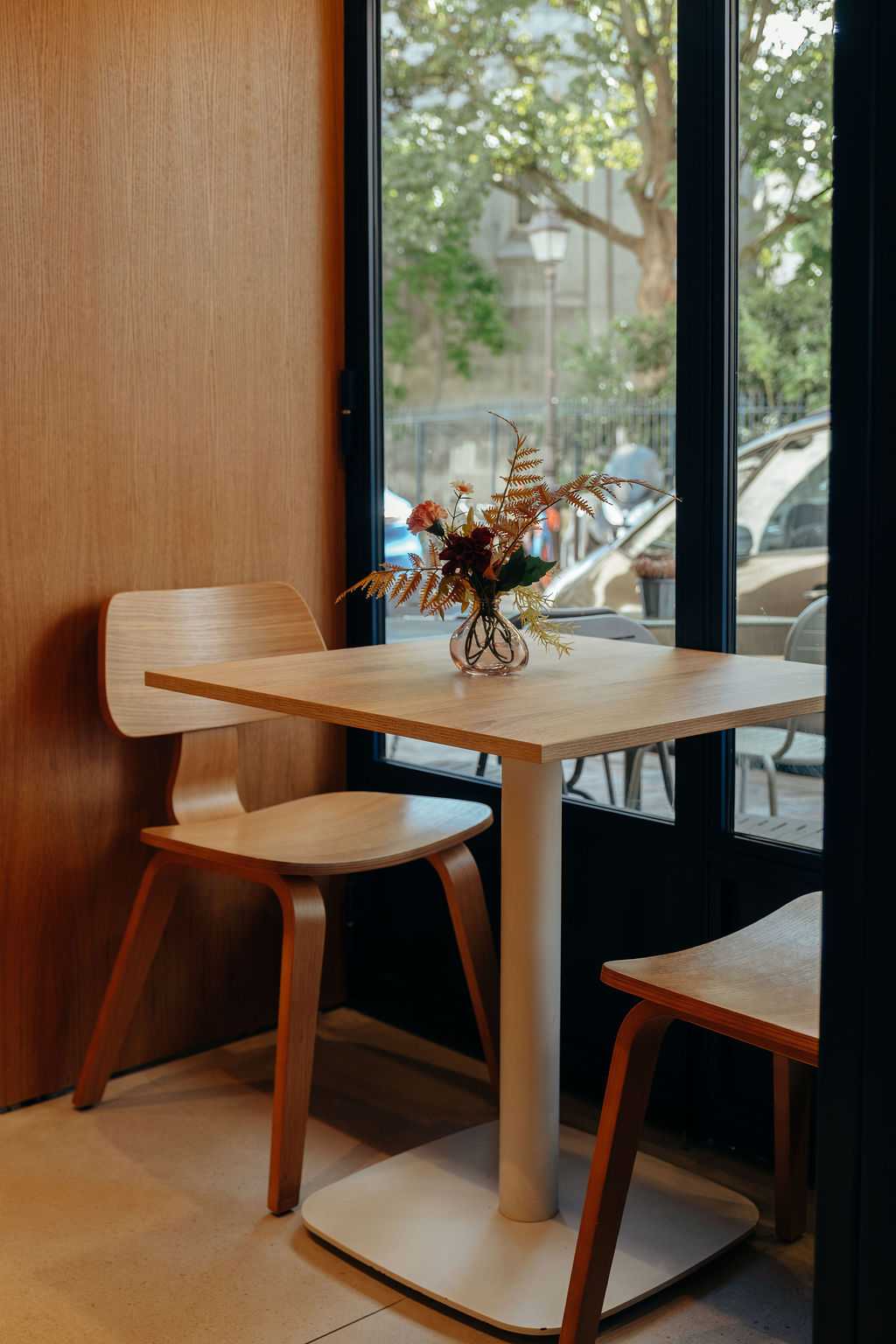
Plusieurs séries d'agencements s'implantent dans cette succession de volumes, proposant aux visiteurs des perspectives et des expériences différentes.
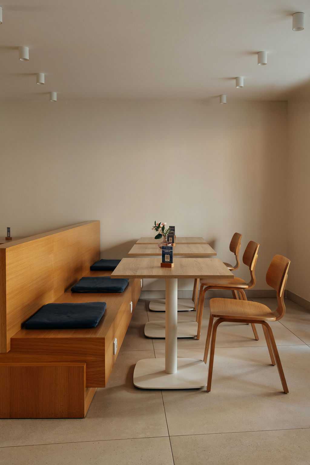
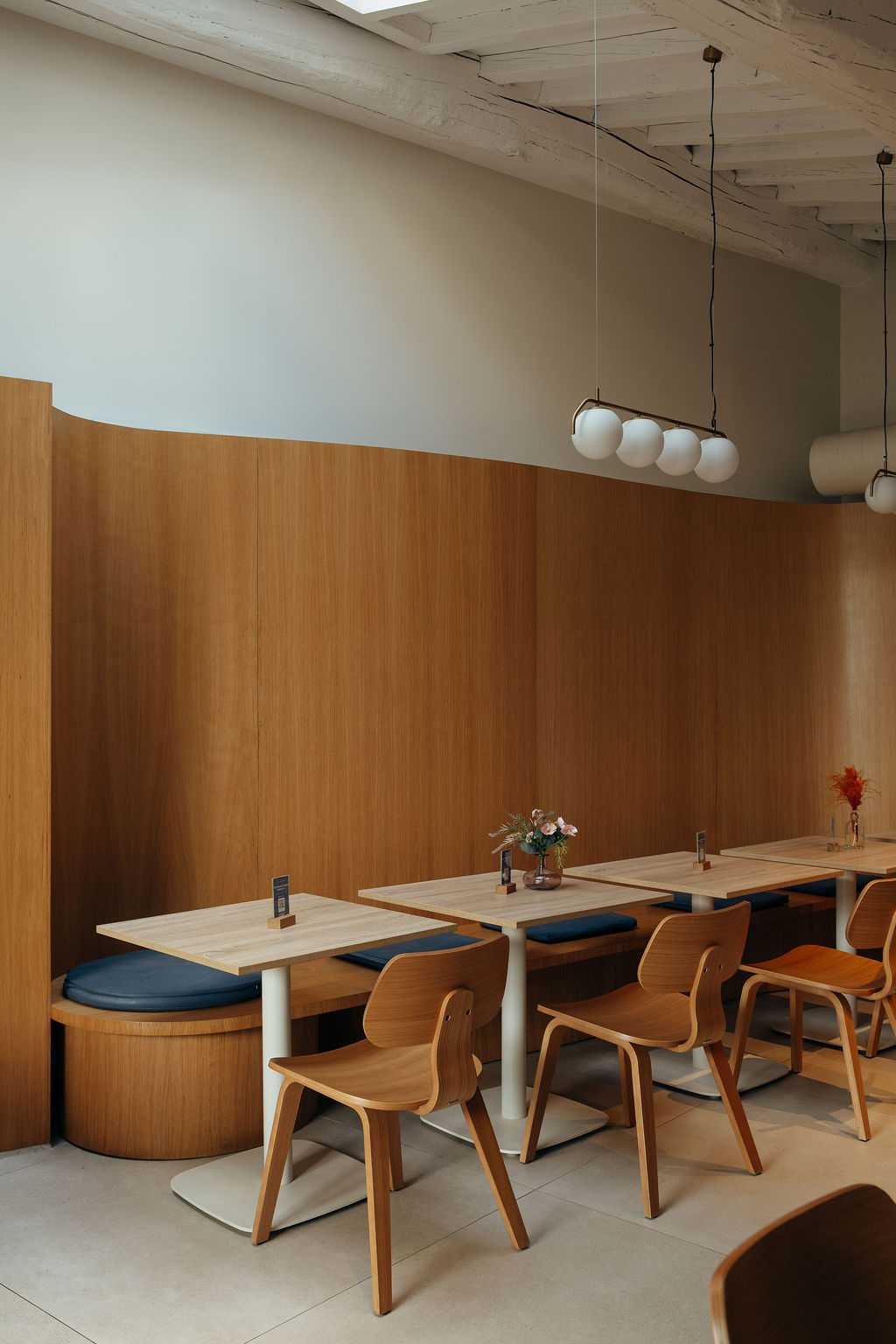
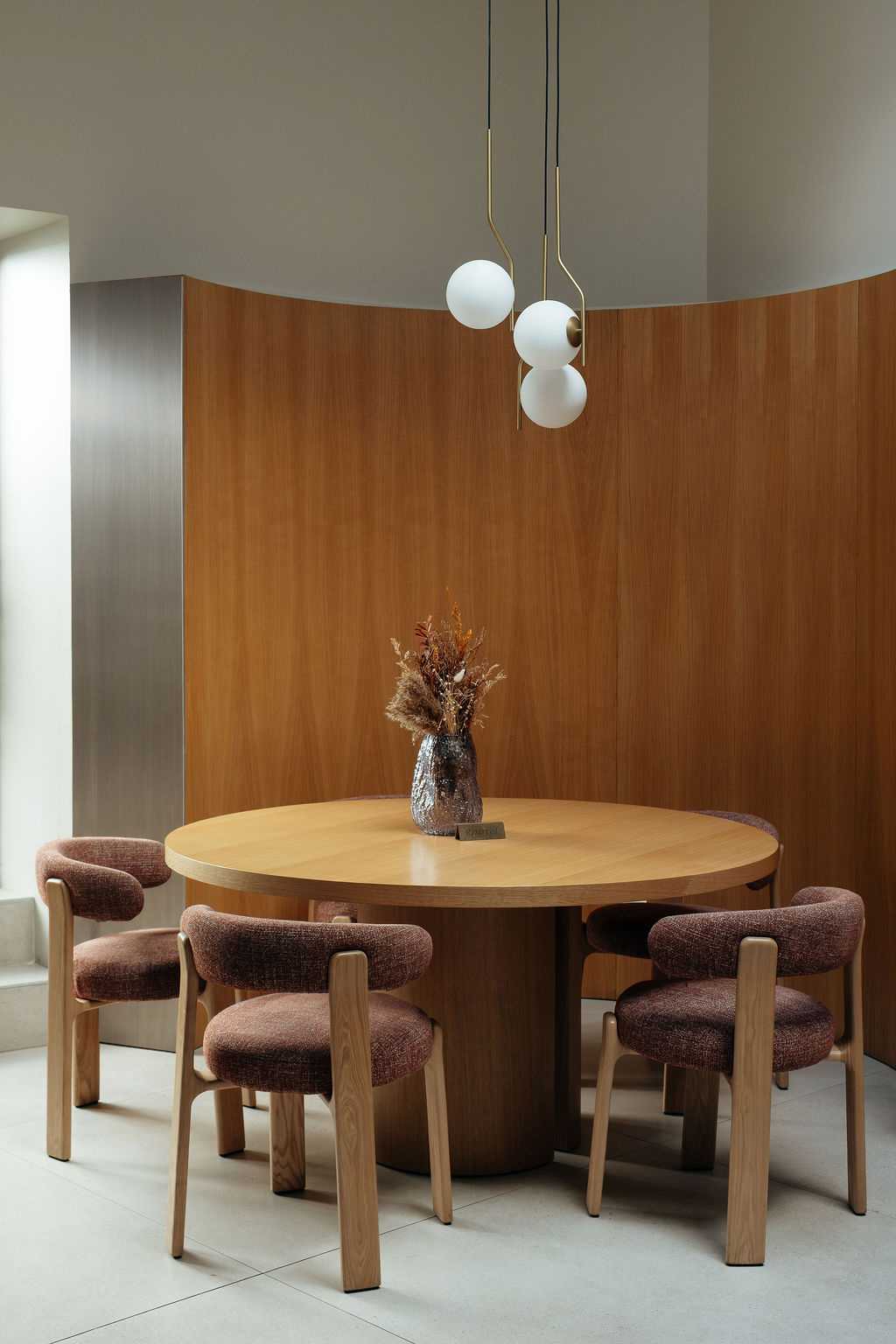
Les banquettes de l'entrée prennent des formes droites, linéaires, solides. Par contre, les banquettes de la grande salle prennent des formes courbes, organiques et sensuelles.
Dans les autres espaces, les tables sont organisées de façon modulaire, permettant de configurer des tablées adaptées en fonction du nombre de convives.
Un bloc sculptural pour la cuisine et les sanitaires
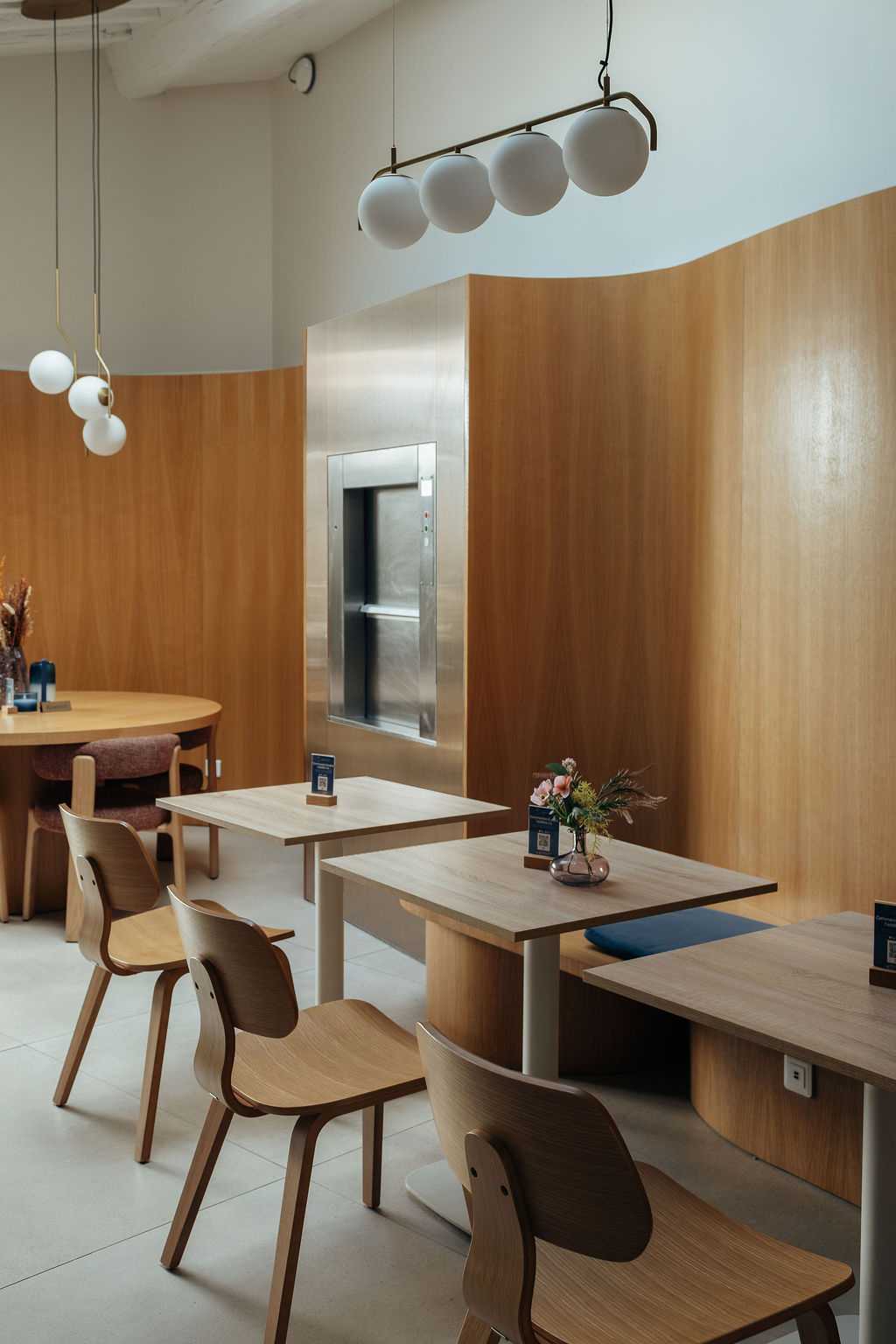
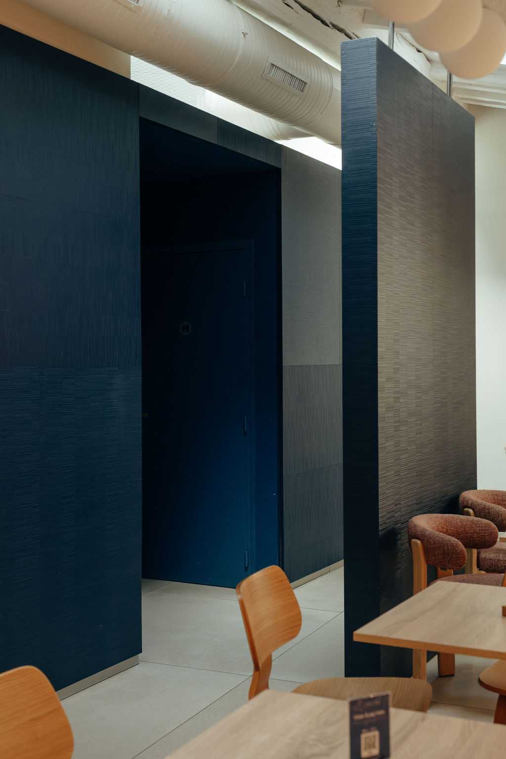
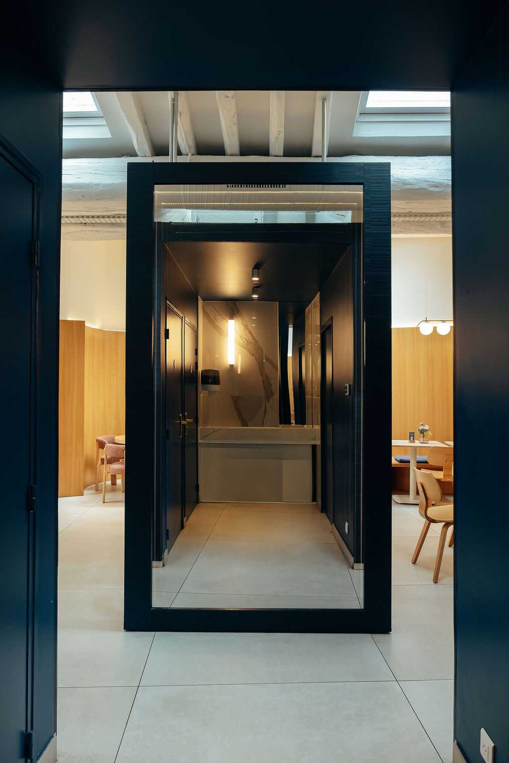
La façade de la cuisine et des sanitaires est constituée d'un bloc unique. Ce volume est posé dans l'espace, créant un contraste entre le revêtement bleu et des peintures claires.
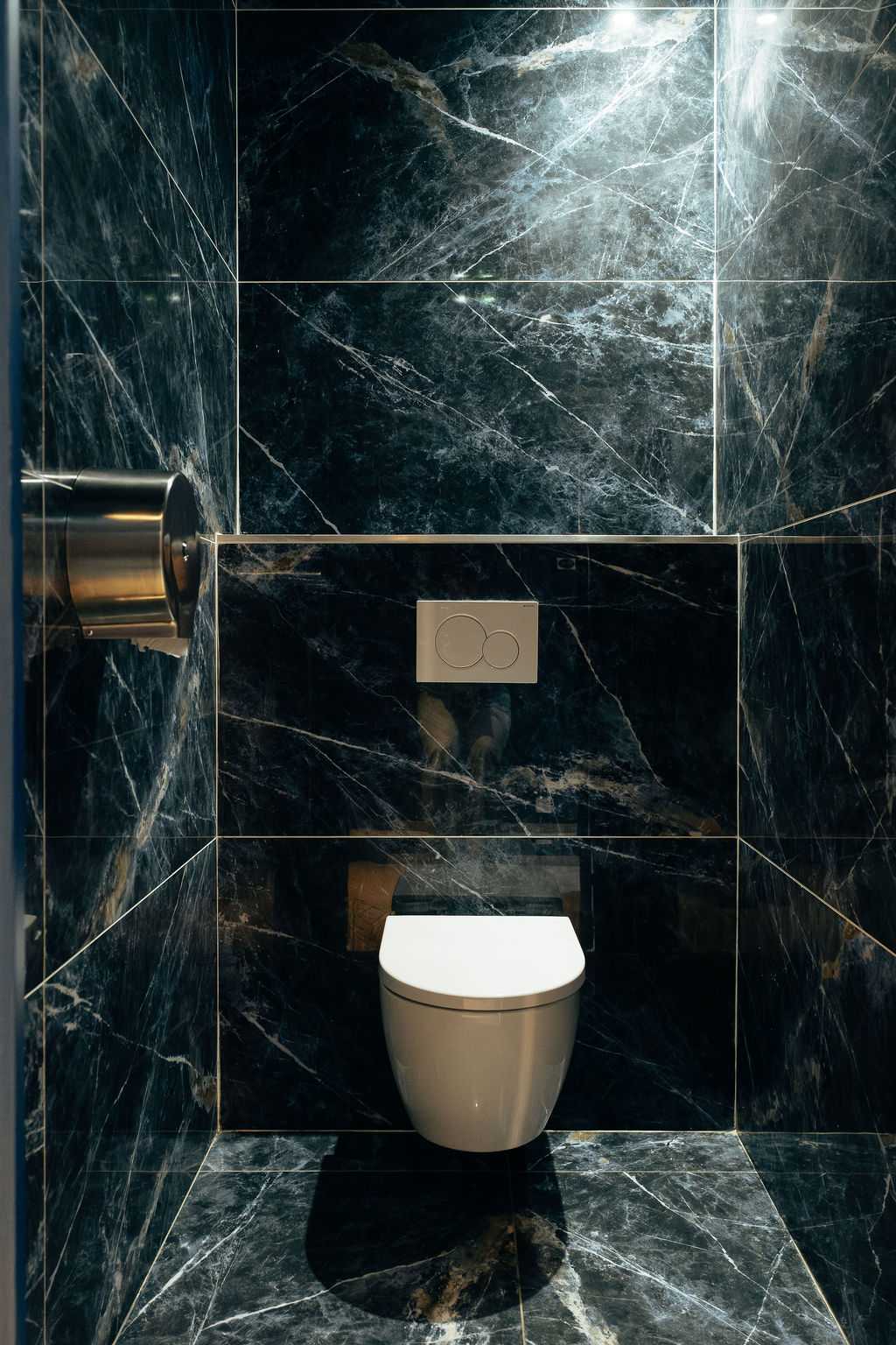
Le passage vers les sanitaires est littéralement un morceau de cette façade, translaté vers la salle. Ce passage accueillant un grand miroir à la sortie offre un brise-vue sur la sortie des WC.
De tout point d'où l'on observe l'espace, les lignes sont tendues les unes vers les autres formant l'unité de ce projet d'architecture commerciale.
En association avec l'agence Glenn Medioni
Photographe : Marie Malandain
A blue façade, two entrances
The façade sets the tone with an intense blue applied across the entire frontage, clearly distinguishing two separate entrances. On the left, visitors access the takeaway area (pastries, viennoiseries, ice cream, coffee, etc.). On the right, the full depth of the restaurant unfolds, from the first tables through to the private courtyard at the rear.
An optimised layout was designed while taking into account the building's constraints, particularly its unusually low ceiling. The space is immediately given greater height and character by an old, massive roof structure made of large century-old timber beams.
Continuing from the takeaway area on the left, the kitchens are located further inside. This linear arrangement optimises the overall volume and systematically organises the flow between the different workstations.
The reception and bar are positioned immediately within this first area, allowing the staff to efficiently direct visitors towards the seating area best suited to their preferences.
Design tailored to each atmosphere
Several series of bespoke elements are arranged throughout this succession of spaces, offering visitors different perspectives and experiences.
The benches at the entrance feature straight, linear forms that feel solid and structured. By contrast, the benches in the main dining room adopt curved, organic and sensual forms.
In the other areas, the tables are arranged in a modular configuration, making it possible to create seating arrangements adapted to the number of guests.
A sculptural block for the kitchen and restrooms
The kitchen and restroom frontage is conceived as a single architectural block. This volume is set within the space, creating a contrast between the blue finish and the light-coloured walls.
The passage leading to the restrooms is literally a section of this façade, shifted towards the dining room. A large mirror at the exit provides a welcoming feature while also screening the view towards the restroom doors.
From every vantage point, the architectural lines draw the eye towards one another, creating the unity of this commercial architecture project.
In collaboration with Glenn MedioniPhotographer: Marie Malandain


